
Data Visualization using Plotly
About this Course
Welcome to this 1 hour long guided project on Data Visualization using Plotly. Plotly is a python graphing library which is used to make interactive, publication-quality graphs. It allows users to import, copy and paste, or stream data to be analyzed and visualized. In this project you will learn how to create beautiful visualizations using Plotly constructs. This guided project is for anyone who wants to learn data visualization or already in the data science field.Created by: Coursera Project Network

Related Online Courses

This course was designed to provide an understanding of user and resource management in Google Workspace. Learners will explore the configuration of organizational units to align with their... more
Spacecraft relative motion control solutions stabilize the spacecraft relative to another spacecraft. This is useful control the approach prior to docking, to circumnavigate while inspect the... more

Our course explores what can be done to solve the complex problem that half a billion people worldwide do not have improved water supplies and two billion do not have improved sanitation. We look... more
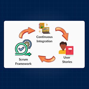
The Agile Development Excellence specialization provides a thorough understanding of Agile methodologies, focusing on the Scrum Framework, User Stories, and Continuous Integration practices.... more

This course is targeted toward individuals wishing to operate a family day care center, and it covers topics including the fundamentals of early childhood development; the importance of play and... more
Powered by
![]()

